Generate Poster Blog
Classic Mafia Poster Prompts Without Copying a Franchise
2026-03-09
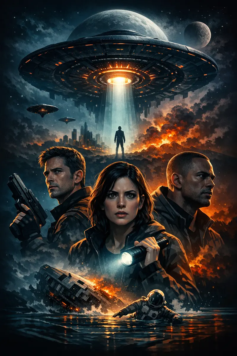
The classic mafia poster prompts that actually work never mention a film. They describe light, wardrobe, palette and composition — the four things that make a crime-drama poster read as prestige rather than parody. Name a title, a character or a studio instead, and you get one of two poor outcomes: a thin imitation of something you cannot use, or a licensed wordmark quietly baked into your download.
The eight prompts below are written the other way round. Each one describes the craft of 1970s American crime drama so the model builds the mood from scratch. Paste any of them straight into the classic mafia poster generator and adjust from there.
The four levers that carry the crime-drama look
Every convincing prompt in this style pulls the same four levers. Learn them once and you can write your own variations without copying anyone.
Lighting. Low-key, one dominant warm source, hard falloff into black. The key sits high and slightly to one side so the brow casts down and the eye sockets sink into shadow. Practical lamps inside the frame — a desk lamp, a table candle, a hanging bulb — sell the era instantly.
Palette. Desaturated and warm-neutral. Black, charcoal, oxblood, tobacco brown, brass and amber. Almost no blue, and never a saturated one. Skin tones stay warm and slightly ruddy rather than clean and even.
Wardrobe. Heavy worsted wool, wide lapels, a dark tie on a white shirt, a waistcoat, a pocket square, period barbering. This is the single fastest way to date a portrait to the era, and it does not require naming anyone.
Composition. One dominant chest-up portrait, centred or just off-centre, sitting low in the frame with a lot of empty air above it. Restraint is the whole point — a crowded poster reads as noisy, not powerful.
Add texture on top of all four: fine film grain, a little halation around highlights, and a slight print softness. That is the finish people register as "classic" before they register anything else.
How to write classic mafia poster prompts
Use a fixed order so you can swap one variable at a time:
[main subject] + [crime-drama mood] + [lighting] + [palette] + [composition] + [texture]
Worked example:
Classic crime family poster based on my portrait, dark tailored suit, warm amber key light, deep black shadows, premium theatrical layout, subtle film grain, elegant title space.
That is the baseline. Everything below is a variation on it.
1. Prestige crime-family portrait
Prestige crime-family poster based on my portrait, dark formal wardrobe, rich amber highlights, deep black background, dramatic central composition, elegant title area, vintage film grain.
The workhorse. It gets the palette and hierarchy right on the first pass and leaves the background almost empty, which is exactly what a one-sheet wants. Swap deep black background for dark walnut interior, out of focus when a flat backdrop feels too plain.
2. Shadow-heavy mafia mood
Shadow-heavy cinematic crime poster with one commanding portrait, charcoal palette, warm highlights on the face, minimal background detail, premium hierarchy, restrained typography space.
Use this when the first attempt came back too evenly lit. The phrase warm highlights on the face is doing the real work — it tells the model where the light lands, which implies where it does not. Swap charcoal palette for charcoal and oxblood palette for a fractionally richer grade.
3. Vintage organized-crime drama
Vintage-inspired organized-crime poster from my photo, moody lighting, muted browns and blacks, subtle paper grain, classic one-sheet composition, serious and powerful tone.
The most period-accurate of the three originals, because subtle paper grain pushes the result towards a printed sheet rather than a digital render. Swap muted browns and blacks for faded tobacco and bone tones if you want it to look older still.
4. The doorway silhouette
Cinematic crime poster from my photo, figure standing in a lit doorway, hard backlight, long shadow across a wooden floor, near-black interior, single warm practical lamp, tall empty space above the subject.
A composition prompt rather than a portrait prompt. Backlight plus a long floor shadow reads as tension without any facial drama at all, so it is a good fallback when close-up likeness keeps coming back wrong.
5. The family hierarchy two-hander
Prestige crime-drama poster, one seated figure in the foreground and one standing behind, low warm key light, deep charcoal background, formal tailoring, generous space at the bottom of the frame.
Seated-in-front and standing-behind is the oldest power-hierarchy staging there is. One caveat worth knowing before you try it: only one uploaded photo drives identity, so the second figure is invented by the model. Asking it to carry two real faces tends to blend them or duplicate the first one — the builder actively suppresses extra main characters. Put the person you care about in the foreground and let the model stage the rest.
6. Late-night club booth
Moody crime-drama poster based on my portrait, seated in a leather booth, low amber lamplight, drifting cigarette haze, dark red and brass tones, shallow depth of field, restrained composition with empty space overhead.
Haze is the cheat code here. A little atmospheric diffusion separates the subject from the background and softens the grade in a way that looks expensive. Swap leather booth for back room of an old restaurant for a plainer, more austere read.
7. Rain-street crossover
Dark crime poster from my photo, lone figure on a wet street at night, reflected streetlight on the pavement, heavy rain, desaturated palette with a single amber source, deep shadows, tall vertical composition.
This is where the crime-family look meets straight noir. If you like this one more than the interior prompts, the noir poster generator is tuned for it and will save you the rewriting.
8. Faded film-stock print
Vintage crime-drama poster from my portrait, 1970s film-stock look, slightly faded tones, visible grain, soft highlight bloom, warm shadows rather than pure black, centred portrait, wide empty margin at the base.
The one to reach for when your posters keep looking too clean. Warm shadows rather than pure black is the specific instruction that stops the model crushing everything to digital black. For more of this kind of one-line fix, see our AI poster design tips.
What to avoid in the prompt
Three instructions reliably make results worse:
- "Copy this exact movie poster." You get a muddier version of something that already exists.
- "Make the same poster but with my face." This tends to trigger identity refusals and produces the weakest likeness of any phrasing.
- "Use the franchise logo or title." Trademarked lettering is not yours to download, and models are good enough now to render it convincingly.
The same rule applies to uploads. Never upload an existing poster as a style reference — the model will happily reproduce its wordmark, tagline and copyright line in your output. Upload only your own photo, as the identity reference.
Say this instead of a franchise name
Swap the property for the aesthetic:
- classic mafia poster
- crime family movie poster
- prestige organized-crime drama
- vintage noir crime portrait
- dark cinematic family hierarchy
- 1970s American crime drama one-sheet
These phrases keep the prompt original while matching the intent behind the search. If you want the same treatment applied to a broader thriller look, the cinematic crime poster maker covers the adjacent styles, and there is a wider prompt reference on the AI poster prompts page.
When the likeness does not hold
This is worth saying plainly: face work can fail. Image providers apply identity rules to photos of real people, and prompts that read as changing someone's appearance or clothing are sometimes refused or quietly softened. You will see it as a face that is close but not quite you.
Three things help. Use a sharp, front-facing photo with even light. Keep the prompt focused on lighting, palette and composition, and let the uploaded image carry identity on its own. And when a result drifts, regenerate with a simpler prompt rather than adding more instructions — piling on detail is what usually pushes a likeness off course. Our guide to turning your photo into a movie poster goes deeper on the photo side of this.
About that "title space"
Several prompts above ask for title space or an empty lower third. That is a composition instruction, not a text one — there is no title or tagline field in the builder, so poster text is not something you type. What you are asking for is clean negative space you can letter yourself later if you want a name across the bottom. If the model invents garbled lettering in that space, regenerate and add no text to the prompt.
Start with one prompt, not five
Pick the prompt closest to what you want, change one variable, and generate. A crime-drama poster usually takes a minute or two to come back, so a considered prompt beats five rushed ones.
If you are still weighing up which tool to run these through, what makes the best AI poster generator for cinematic posters sets out the traits that matter for photo-led work. Otherwise, open the classic mafia poster generator, upload your photo, and build the rest from there.