Generate Poster Blog
How to Turn Your Photo Into a Movie Poster with AI
2026-03-09
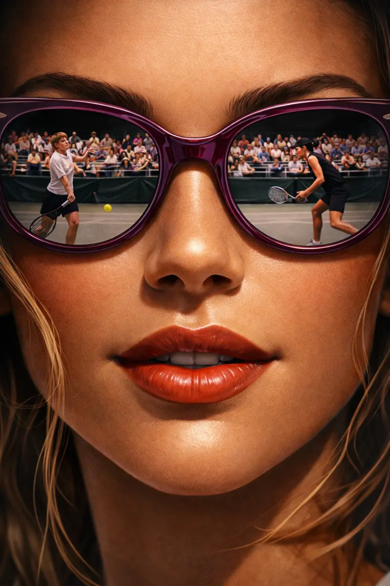
This guide covers one specific job: how to turn your photo into a movie poster with your own face in the frame. That is a different task from designing a poster for an imaginary film from scratch, which is covered in how to create movie posters. When a real photo is the starting point, almost everything about how you write the prompt changes — the model is no longer inventing a person, it is protecting one.
If you want to go straight to the tool, the photo to movie poster flow is built for exactly this. Five minutes of reading first is worth it, though, because the difference between a poster you keep and one you delete is mostly decided before you press generate.
What photo works best for a movie poster?
The best source photo is a sharp, front-facing portrait of one person, evenly lit, with a plain background and the face large in the frame. Everything else is negotiable. If the model can read both eyes, the nose line and the jaw, it has enough to carry your likeness into a completely different lighting setup.
Some practical rules that matter more than they sound:
- Crop before you upload. A wide holiday shot where your head is a small part of the frame gives the model very little face to work from. Crop to head and shoulders first.
- Avoid sunglasses, hats pulled low, and hands near the face. Anything covering the features you want preserved will either be preserved too, or thrown away along with the face underneath.
- Skip heavy filters and beauty smoothing. Those effects remove exactly the small asymmetries that make a face recognizable as yours.
- Even light beats dramatic light. It feels counterintuitive for a cinematic poster, but you want the drama added by the prompt, not baked into the source. A flat window-lit photo relights beautifully. A photo with half the face already in shadow gives the model nothing to relight.
- One person. Two can work. Three or more and something usually goes wrong with at least one face.
Uploads take JPG, PNG or WebP up to 10MB, which any modern phone photo sits comfortably inside.
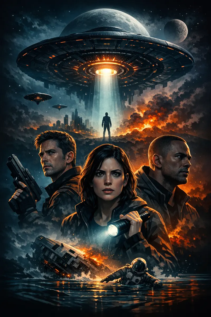
Pick the aesthetic before you pick the photo
Decide what the poster should feel like before you write a word of prompt. Vague direction is the single biggest cause of a bland result. Pick one lane and commit to it for the whole prompt — mixing three moods in one description reliably produces a muddy fourth.
Lanes that consistently work from a single portrait:
- Prestige drama — warm rim light, deep shadow, restrained palette, a lot of empty space.
- Desaturated noir — black and white or near-monochrome, hard single-source light, smoke, crushed blacks.
- Neon thriller — night city, wet streets, cyan and magenta bleed, cold key light on the face.
- 1970s crime drama — amber and umber, heavy grain, formal wardrobe, low camera. If this is your lane, classic mafia poster prompts has the full prompt patterns.
- Sports documentary — hard arena light, sweat, motion. Covered in more depth in how to make a sports hero poster from a selfie.
One thing to avoid entirely: do not describe your poster by naming a real film, director or studio, and do not upload an existing released poster as a style reference. Both routes drag real wordmarks, taglines and copyright lines into the output — text you then have to remove from your own download. Describing the aesthetic in plain visual language gives you a better original result anyway, and it is yours to use.
How to turn your photo into a movie poster, step by step
Here is the whole workflow. To turn your photo into a movie poster you need four decisions and one upload — nothing else.
- Choose a starting point. The builder offers a curated template, or a fully custom poster you describe yourself. Custom gives you the most control and the cleanest, most original output, so start there unless a template is very close to what you want.
- Upload your portrait. The uploaded person becomes the main subject of the poster. This is the important part: the photo controls who is in the poster, and your written description controls everything else. You do not need to describe your own face at all.
- Write the scene, not the person. Lighting, background, camera distance, palette, atmosphere, and where you want space left clear. Roughly sixty words is plenty.
- Generate, then change one thing. A run usually takes a minute or two rather than an instant, so make each one count. Judge two things when it comes back: does the face read as you, and does the mood land? Then adjust one variable and run again.
That last discipline is what separates a good result from twenty near-identical bad ones. If you change the lighting, the palette and the framing all at once, you learn nothing about which change helped.
Three prompts that work, and what to change in each
These are full prompts, not fragments. Paste one, swap the details in bold, and generate.
Prestige drama.
Prestige drama movie poster built around the uploaded person as the lead. Single figure, three-quarter turn, framed from the chest up, shot from slightly below. Warm rim light from the back left, deep unlit shadow filling the right half of the frame. Muted amber and charcoal palette. Fine film grain. Lower third left empty and uncluttered.
Why it works: the light is described by direction, not by adjective. "Dramatic lighting" means nothing to an image model; "rim light from the back left" produces a specific, repeatable result. The dial to turn here is the camera angle — swap "slightly below" for "at eye level" and the whole poster changes register from heroic to intimate.
Desaturated noir.
Black and white noir movie poster with the uploaded person as the only figure. Hard single-source key light from the side, venetian blind shadow falling across the wall behind them. Smoke haze in the air, high contrast, crushed blacks, one bright specular highlight in each eye. Wet pavement reflection along the bottom edge. Upper third kept clear.
Why it works: monochrome removes a whole axis the model can get wrong, so more of its effort goes into structure and light. The specular highlight instruction matters more than it looks — eyes without a catchlight read as dead, and it is the first thing that makes a noir portrait feel lifeless. The dial to turn is the shadow pattern: swap the blinds for "rain streaks on glass" or "a doorway of light on the floor".
Neon thriller.
Modern thriller movie poster, uploaded person as the lead, chest up, facing the camera directly. Rain-soaked city street at night behind them, thrown out of focus, neon signage bleeding cyan and magenta into the wet air. Cold blue key light on the face, warm practical light behind the head. Shallow depth of field, heavy atmosphere, clear vertical space at the bottom.
Why it works: the color contrast is doing the heavy lifting — a cold key against a warm backlight separates the subject from the background without any outline effect. The dial to turn is the depth of field. "Shallow" keeps the face dominant; ask for a sharper background and the poster becomes about the city instead of the person.
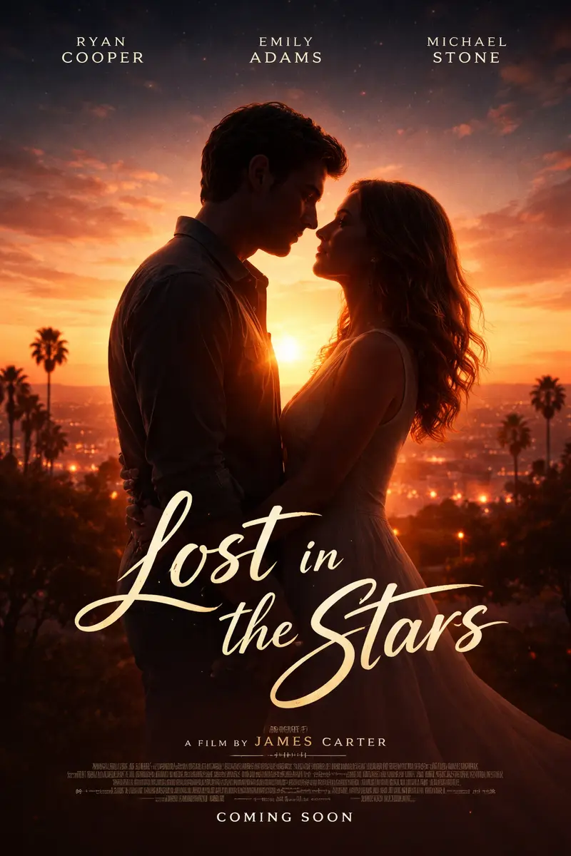
Why the face sometimes changes, and what to do about it
Sometimes the poster comes back beautiful and the person in it is not you. This happens, it is not your fault, and it has two distinct causes with two different fixes.
Cause one: the prompt crowded the photo out. The more you describe the character — their build, their expression, their age, their hair — the more the model treats those words as instructions rather than treating your photo as the truth. Fix: delete every word about the person. Describe only light, background, framing and mood. A shorter prompt almost always produces a stronger likeness.
Cause two: policy. The image model applies restrictions to identity work on photos of real people, particularly around changing someone's face or putting them in a different outfit. When it declines, it does not tell you — it simply generates a person who is not quite you. Fix: pull back on the transformation. A poster that relights and reframes you tends to go through; one that asks to swap your face onto a different body, or to dress you as a specific character, is much more likely to come back as a stranger.
Worth knowing plainly: nobody has fully solved this. Any tool promising a perfect likeness every time is describing a best case, not an average one. Budget for a second run, keep the prompt lean, and start from a front-facing crop — those three habits cover most of the gap. There is more on likeness specifically in how to make a poster of yourself.
There is no title field, so leave room for one
This surprises people, so it is worth being direct: there is no box where you type your poster's title, tagline or credits block. You can ask for lettering inside your prompt, and the model will often render something that looks like a title — but the exact wording is not dependable. Sometimes it invents a word. Sometimes it invents a whole cast list.
So plan for it. Two workable approaches:
- Design the space, add the type later. Include a phrase like "lower third kept clear and uncluttered" in your prompt, then set your real title over the downloaded file in any editor, from a phone app to a full design tool. This gives you exact wording and exact typography.
- Let it render decorative lettering and accept what comes. Fine when the poster is for a wall or a gift and the words are atmosphere rather than information.
What does not work is treating a generated title as final copy without reading it. Check every letter before you print. General prompting habits like this one are collected in 10 AI poster design tips for beginners.
Keeping the poster printable
Posters come out in the classic 2:3 portrait shape, which is convenient because it is also the standard poster ratio. It maps without cropping onto 12x18, 16x24, 20x30 and 24x36 inch frames, and onto 30x45 and 60x90 cm metric sizes. A-series paper is a different ratio, so an A3 print will need either a slight crop or a border.
Two things to check before you send anything to a printer:
- Compare pixels to print size. Divide the file's pixel width by the print width in inches. Around 150 ppi is comfortable for a poster viewed from across a room; aim closer to 300 ppi for anything you will stand near and study.
- Look at the shadows on a bright screen. Deep blacks that look rich on a backlit display can print as a flat, featureless block. If your poster leans heavily on crushed blacks, lift them slightly before printing.
Composition helps here too. One person, one clear mood, one dominant focal point — that is what survives being reduced to a thumbnail and what holds up at full poster size.
Turn your photo into a movie poster
The short version: crop tight on a well-lit front-facing portrait, pick one aesthetic and describe it physically, let your photo carry the identity while your words carry the scene, and leave clear space where a title will go. If the likeness drifts, cut the prompt down rather than adding to it.
When you are ready, open the photo to movie poster flow, upload your portrait, and build something cinematic out of a picture you already have.